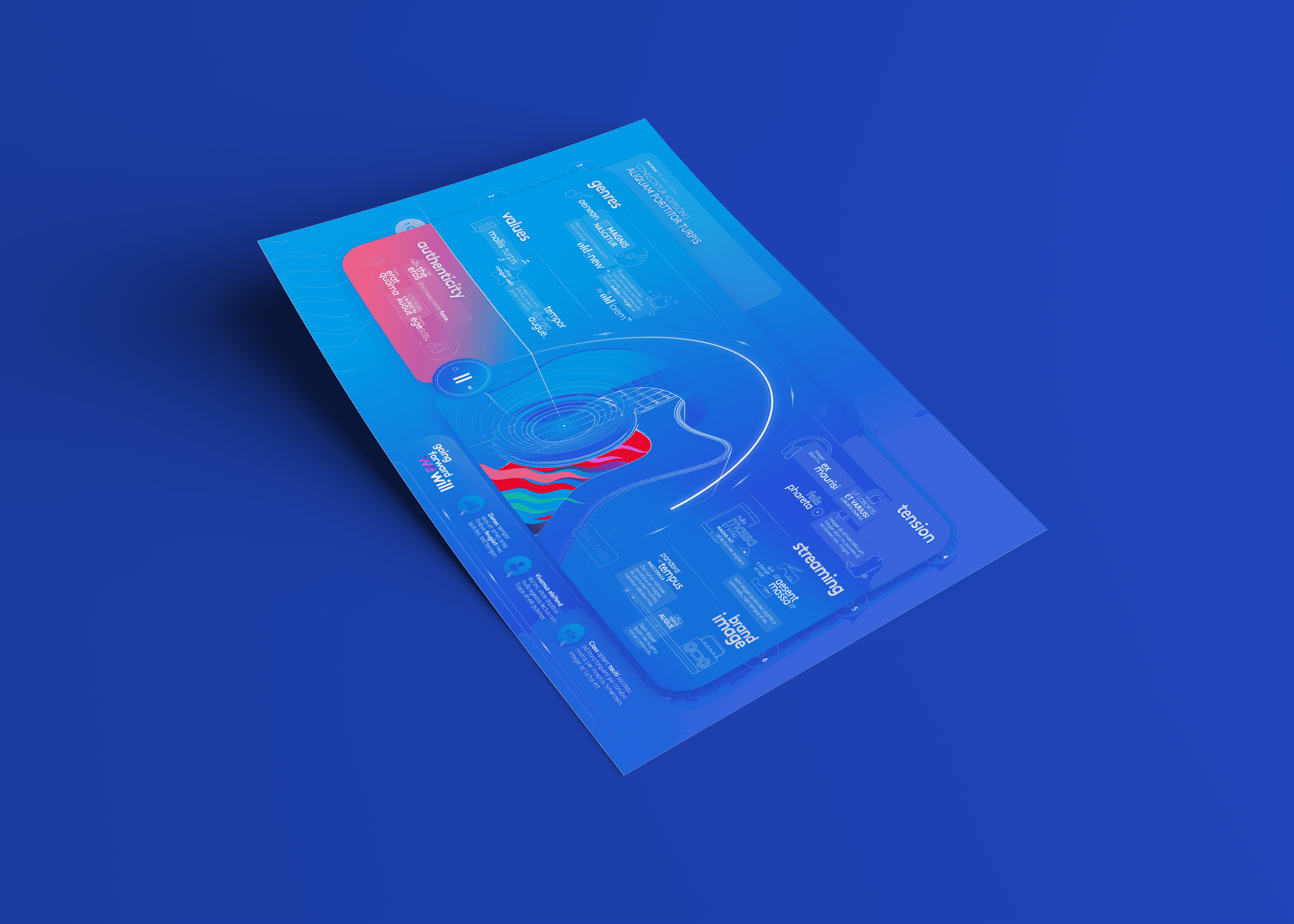
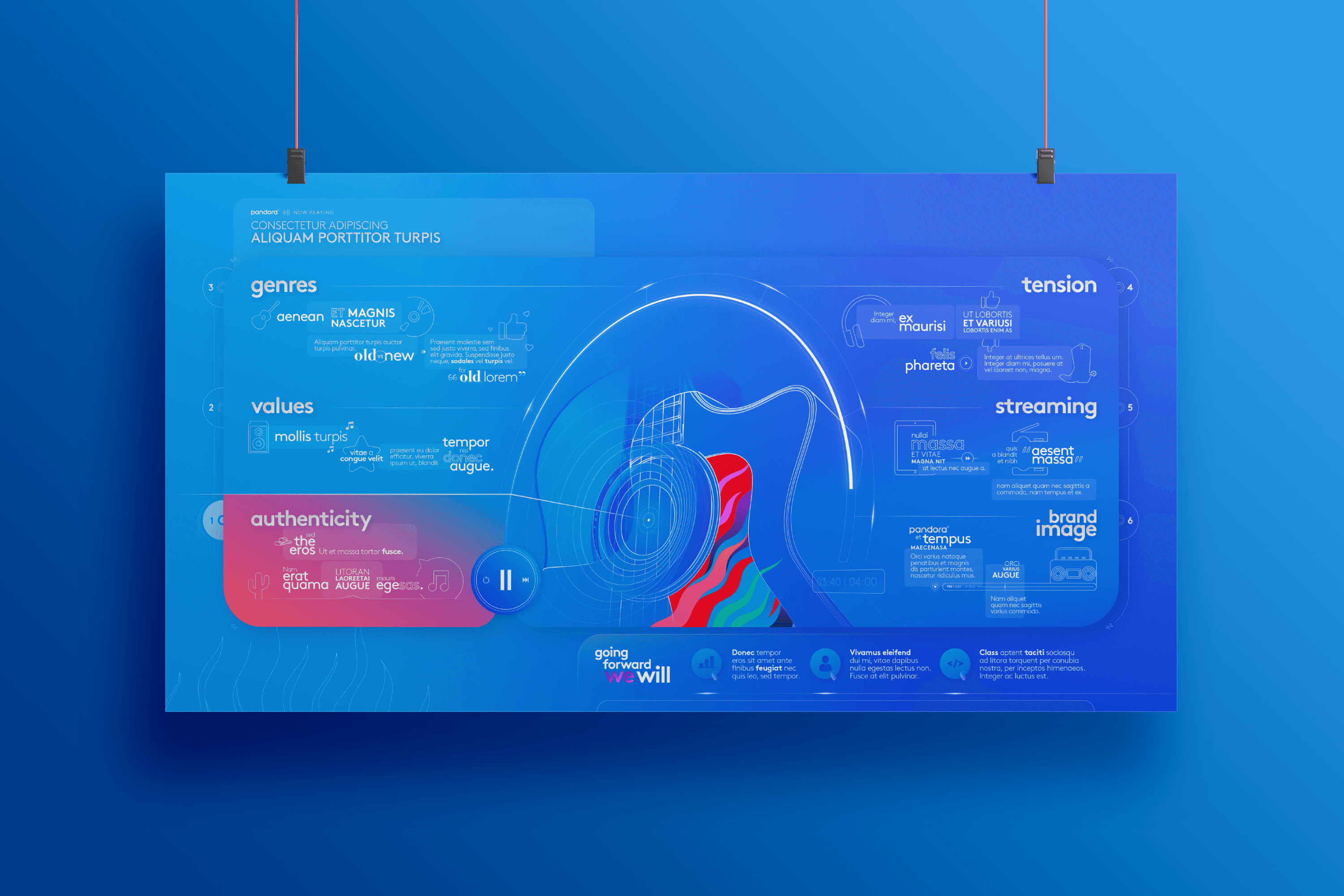
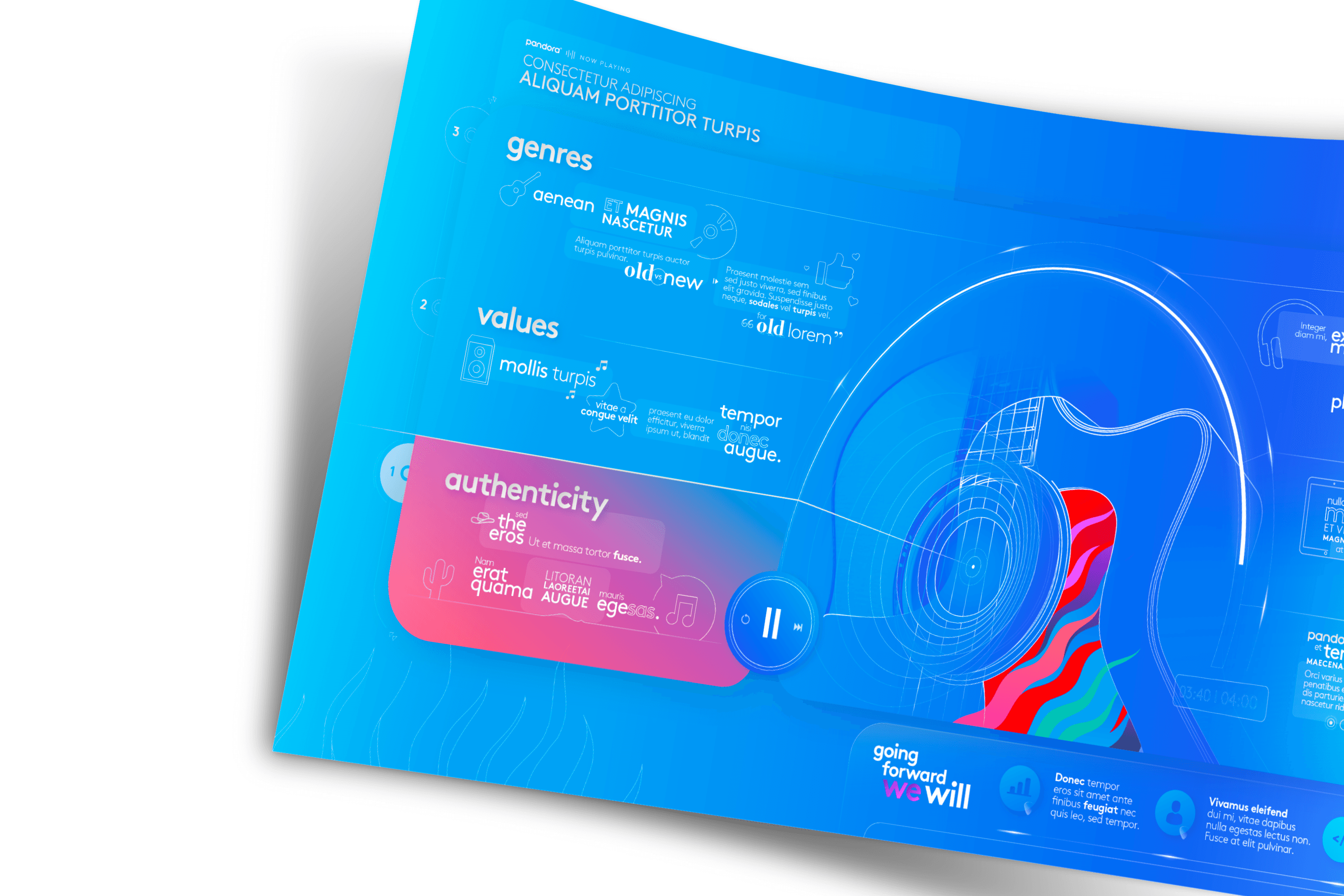
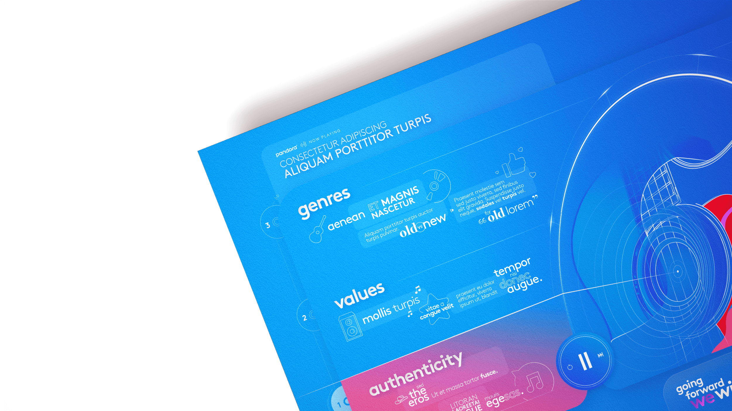
This infographic was created for Pandora as part of a research report, transforming essential findings and marketing opportunities into a dynamic, music-themed visual piece.
Designed to communicate six key themes from the study, it blended illustration and structured data in a format inspired by a streaming interface, making the insights more accessible and engaging.